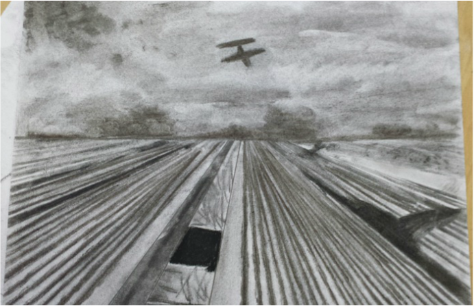
The element I ended up doing was either line or value. I used line to add the perspective of the image which made the image look more at a distance. Also value was used to make the image look a little more 3D or to help make the image look more real. Also the value helped add the shadows.
The medium I used was charcoal because I thought it could work to add value to the photo. Also the photo was originally black and white which charcoal is just that color. Charcoal usually adds a cool touch also.
The subject I chose was perspective because it's always cool to make a landscape look 3D or like you are actually climbing the object. I thought a landscape image would be different than what I've done before but perspective usually gives some sort of guideline to follow.
 RSS Feed
